SABER
Want to say something impactful about this paint and it's origin, this is the place to do it - this is an example of what a user would get when they click on the stains from the hub page or the side bar that is on the internal subpages.

You may have heard the Spanish proverb about the cobbler who’s so busy tending to the needs of his customers that his children have no shoes. This “Cobbler’s Children Syndrome” can impact businesses of all sizes. Not at TEW Design Studio! We walk the talk by prioritizing interior design that brings us great joy in our workplace and our own homes.
When Rima Nasser and her husband welcomed their second child last year, they realized it was time to create their forever home. Enjoy this three-part series revealing design decisions for an interior designer’s own home remodeling project. In Part One, we focus on Rima’s kitchen remodel.
Built in 1993, the residence Rima and Andy selected held a lot of potential but needed to represent their growing family’s lifestyle. For Rima, it was also about doing something she had never been able to do before. Namely, the freedom to design without restrictions or uncertainties, such as worrying about potential resale.
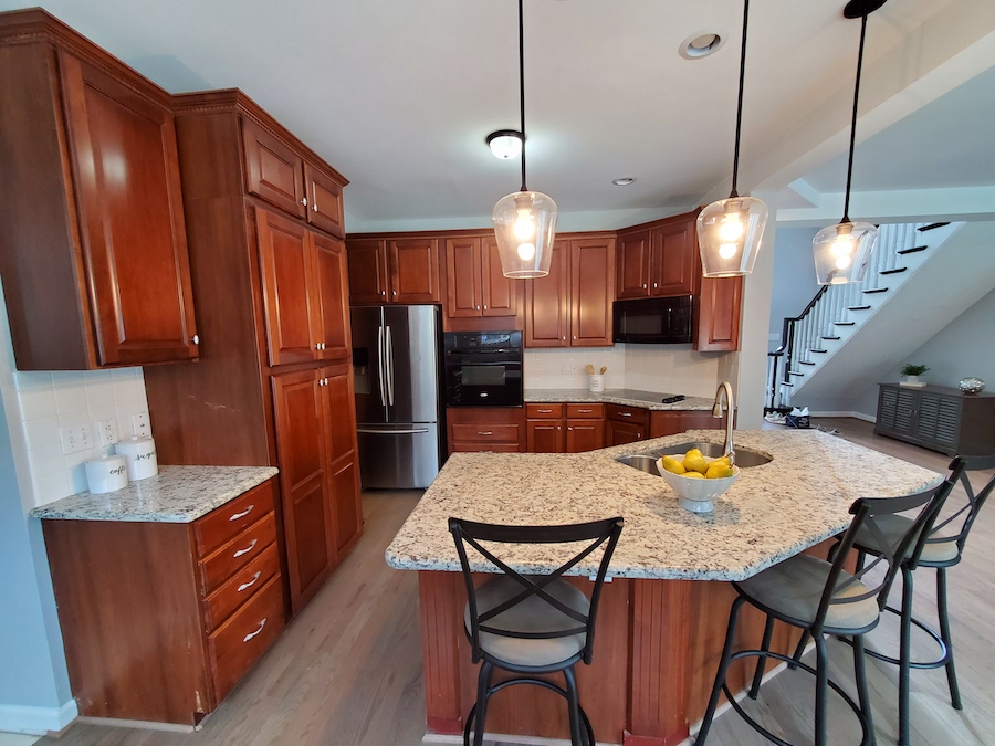
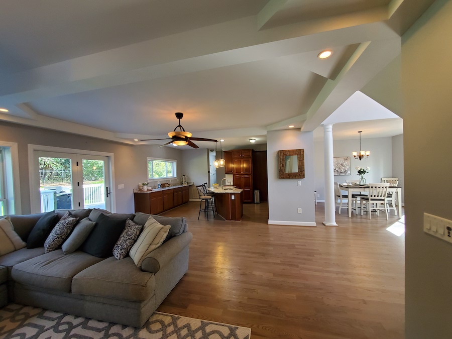
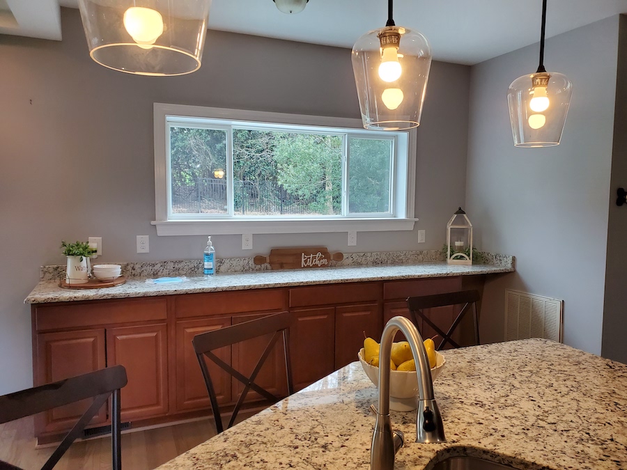
As you can see, the biggest challenges in this kitchen were the hodge-podge cabinetry, dated materials, unusual angles, and an unsatisfactory layout.
Similarly, the kitchen was closed off to the adjacent dining space and beautiful patio garden off the back of the house. An opportunity presented itself to improve the functionality and highlight existing features to create a beautiful space for entertaining.
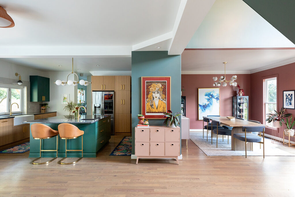
On the wish list, Rima’s family needed more functional storage, better flow, and access to the outdoors. Reconfiguring the space meant moving the refrigerator and sink to take advantage of unused space and new possibilities.
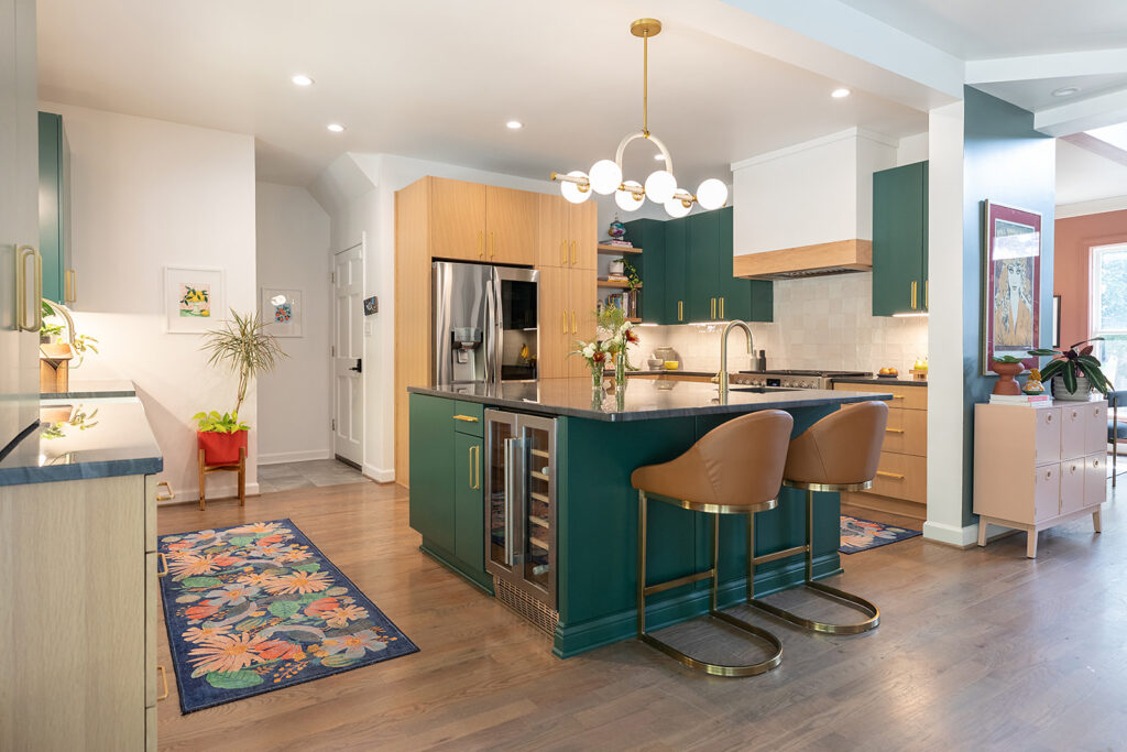
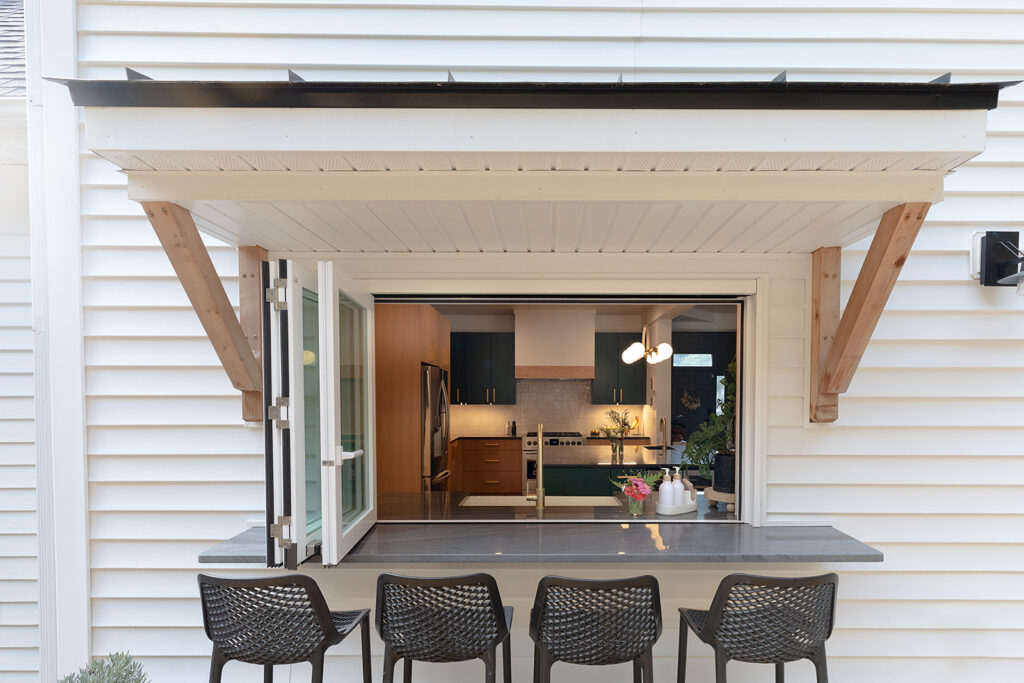
An accordion pass-through window feature was a critical component to this kitchen’s spatial design. It allowed for a better transition to indoor-outdoor living and dining.
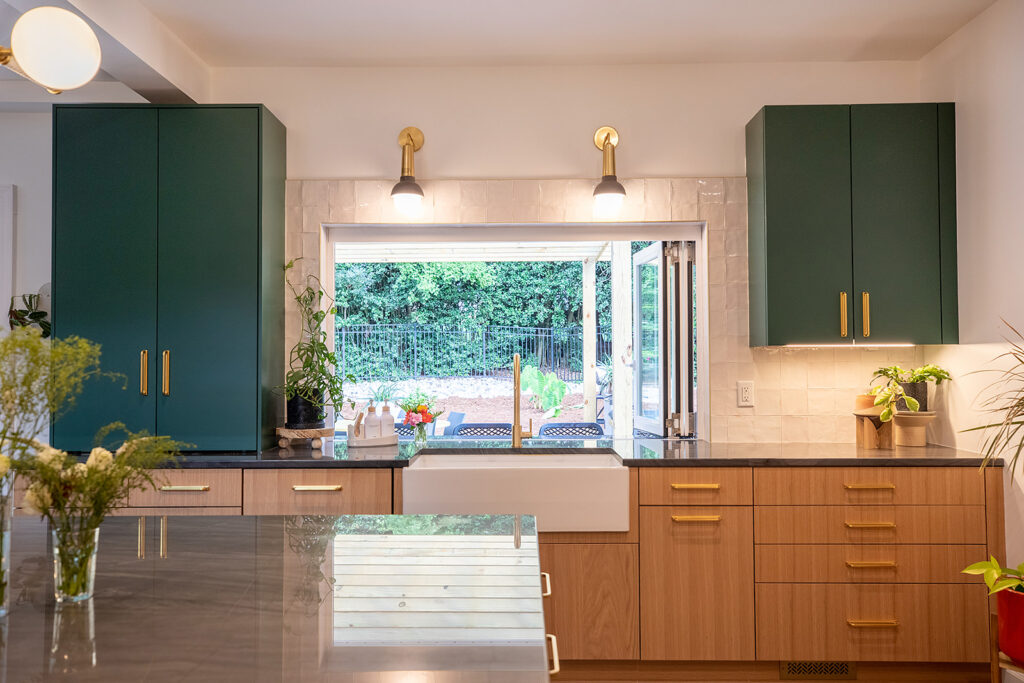
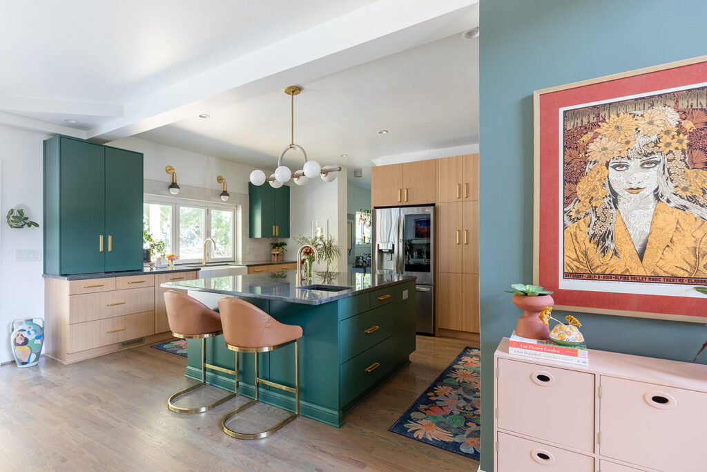
To make the home more functional for everyday living and entertaining, the kitchen needed to leave the old cabinetry layout behind and better illuminate the space. Lighting selections showcase wall sconces over the sink, recessed lighting in the ceiling, under cabinet task lighting, and a dramatic linear chandelier above the island.
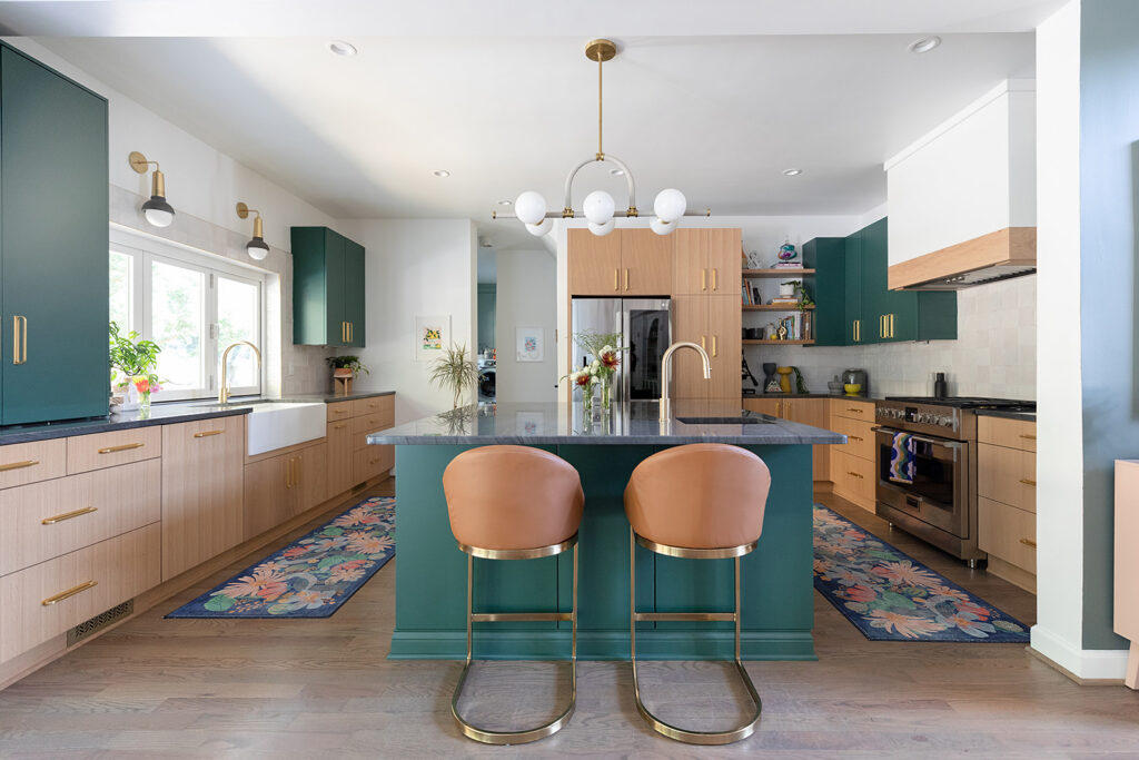
Natural light is accentuated with the pass-through window, bringing fresh air indoors as well as adding convenience to outdoor dining.
The large island centers the space and adds functionality with a wine and beverage refrigerator. It also provides additional storage and serves as an eating area as well as a second sink adjacent to the cooktop to maximize use of the space.
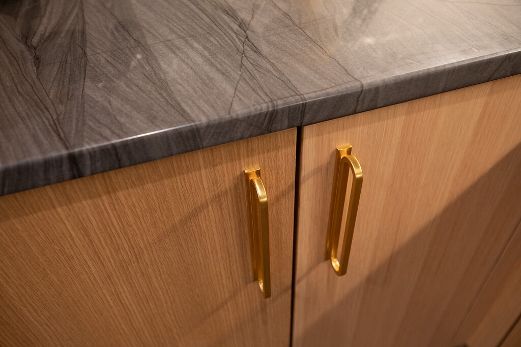
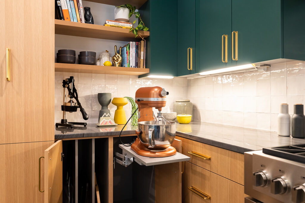
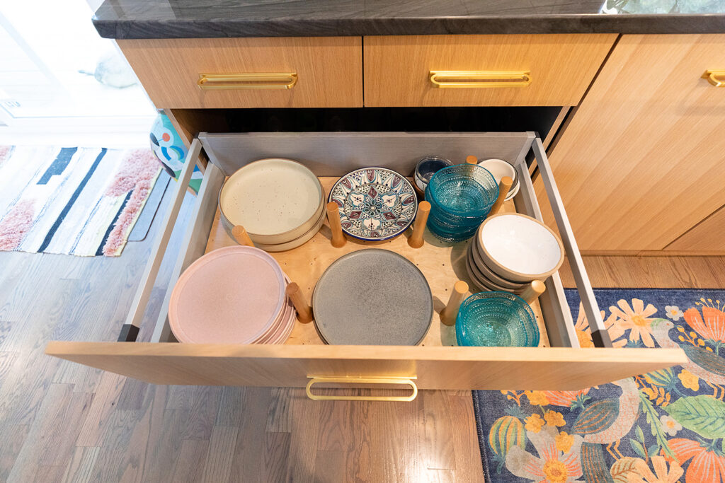
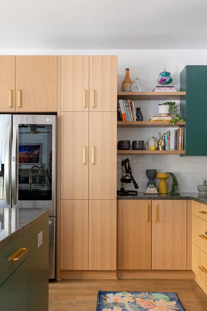
New upper and lower cabinets are more intentional, featuring dramatic hardware pulls that serve a dual purpose. Not just showstoppers, these pulls are perfect for little hands to grab onto, rather than dirty the cabinetry. Storage innovations experiment with new specialty products, materials, and fixtures that the TEWcrew relies on for clients.
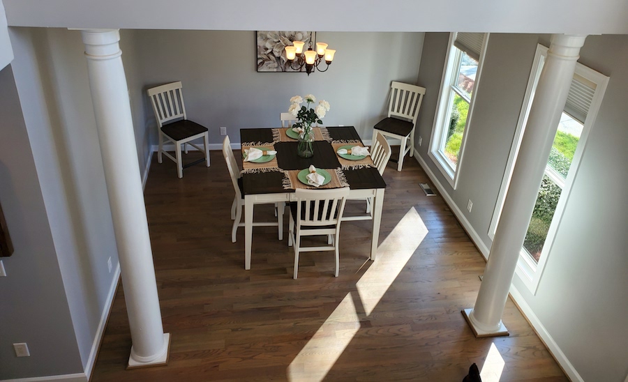
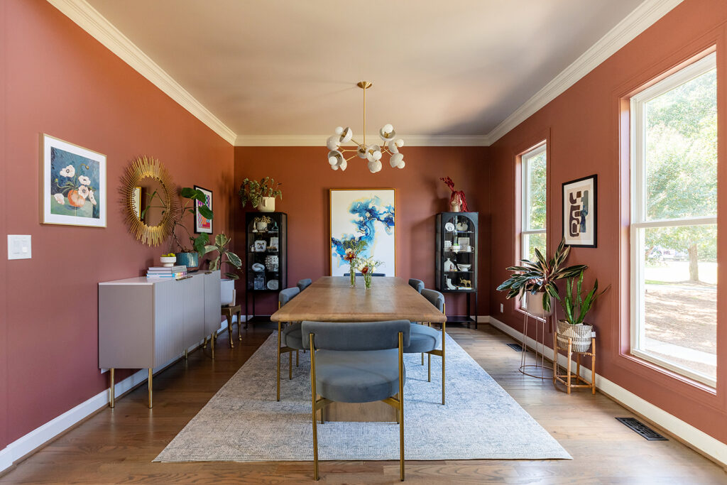
The adjacent dining room also received a dramatic transformation with the removal of two colonial-style columns, while carrying through the color palette from the kitchen.
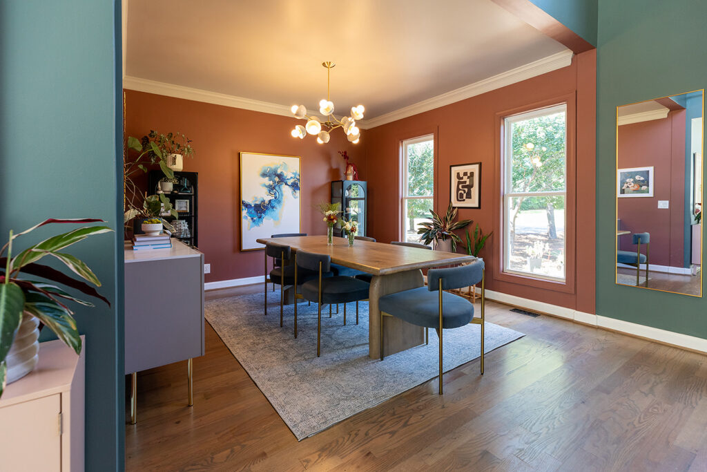
An elegant chandelier hangs above the Dutch-inspired modern dining table, with buffet cabinet as well as matching China cabinets adding upscale finishes to create a warm gathering space.
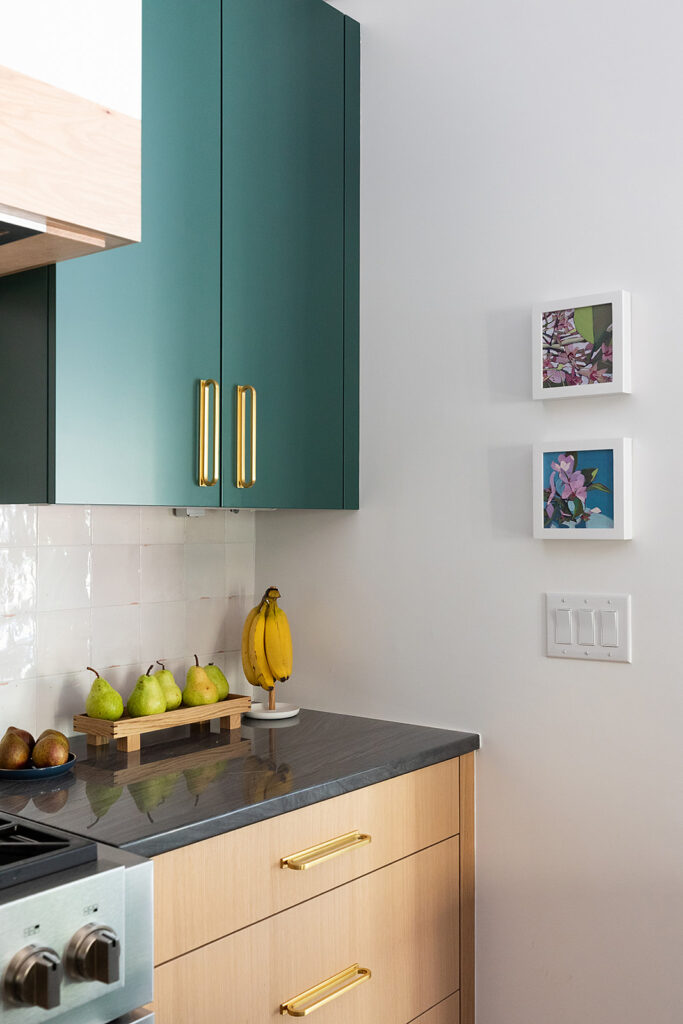
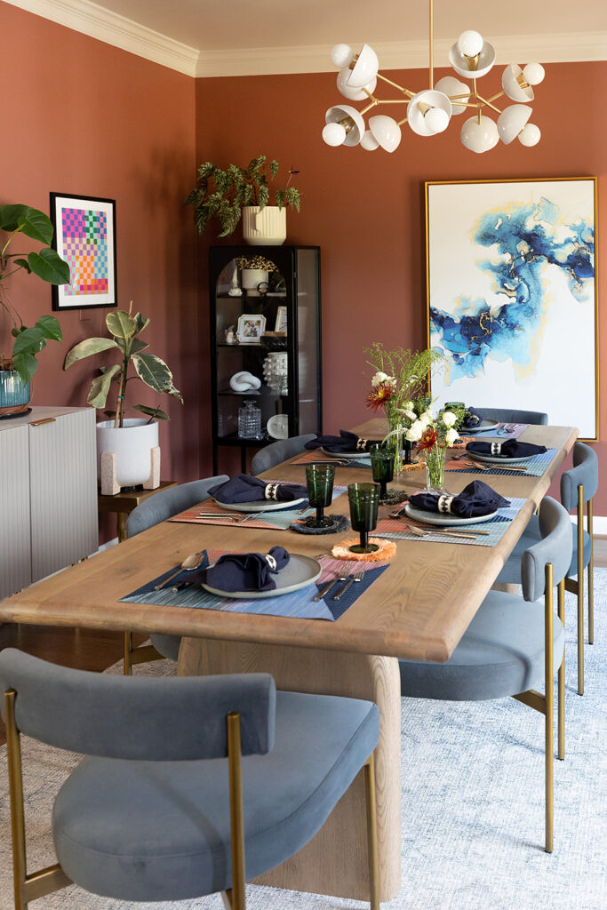
Stay tuned for Part Two next time when we reveal Rima’s redesigned primary bedroom and bathroom.
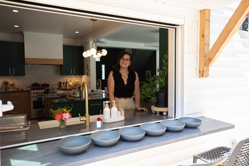
We enjoy revealing our own work, in late 2020 we shared the inspiration for our new office showroom. We’ve also shared nursery and bedroom designs as our families have grown, including the nursery design process for Rima’s first child.
If your family’s outgrowing your space, or you’ve simply grown tired of living in the same environment, it may be time for new ideas.